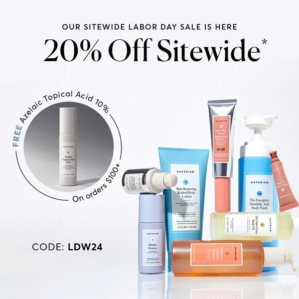
A clean, studio-lit display of skincare products paired with a clear percentage discount and a high-value purchase incentive.
Free credits included. No card required
This skincare bundle ad creative leverages a high-contrast visual display of the product range against a clean, uncluttered background to anchor the offer. By placing the 20% discount headline at the top and the specific threshold-based incentive in a secondary visual circle, it effectively guides the viewer's eye from the general sale news to the actionable bundle value. The primary strength of this ad is its ability to communicate both the savings and the entry barrier—orders over $100—in a single, scannable look.
For most ecommerce teams, this modular approach works because it minimizes cognitive load while focusing on clear value propositions. Using Promer AI, you can replicate this clean studio-style presentation for your own SKUs, ensuring that your offer remains the hero of the image. When testing similar structures, typically keep your secondary offer incentives isolated from the main headline to maintain visual hierarchy.
Great ads start from a balanced structure that highlights the offer first and the product benefits second.
Pro tip
When running high-threshold offer ads, consider A/B testing the dollar amount of your threshold versus the attractiveness of the free gift. Small adjustments to the visual weight of the 'Free' text can significantly change your click-through rate in a 1:1 format.
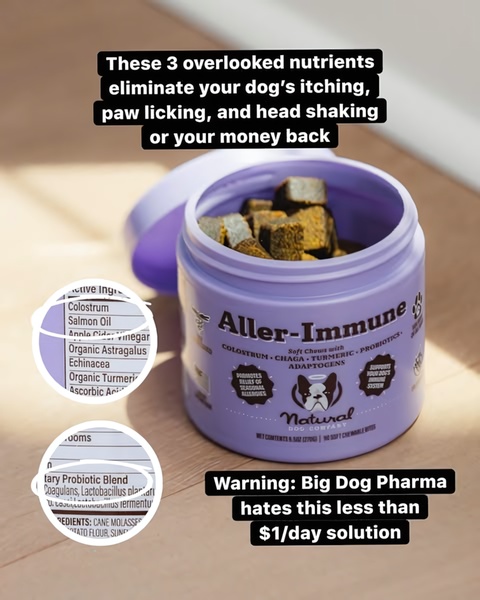
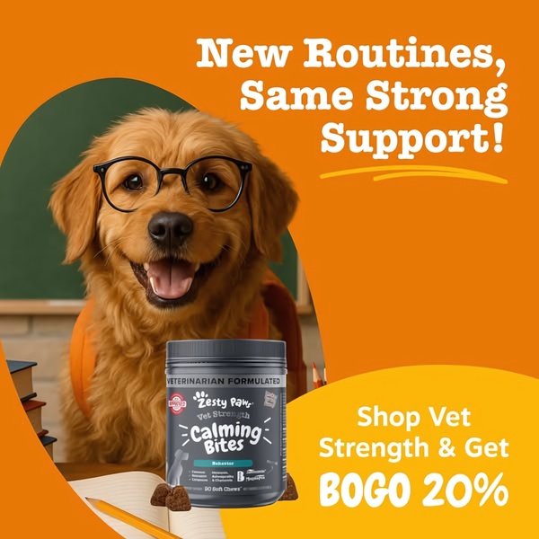
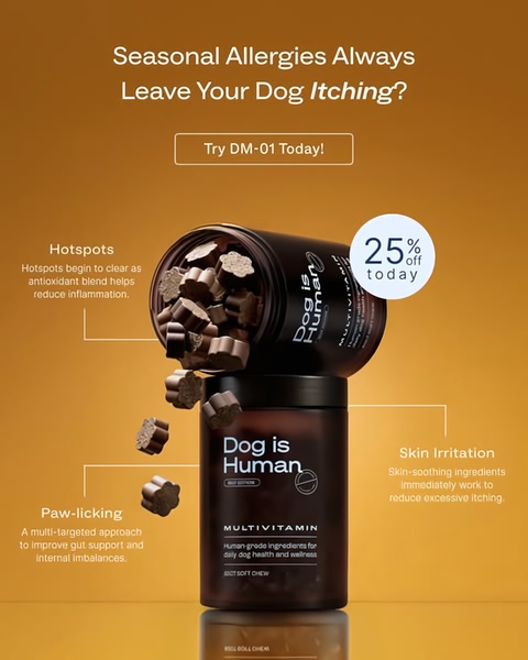
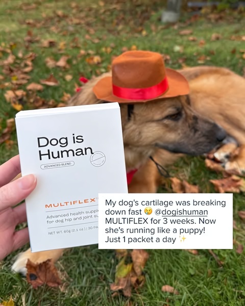

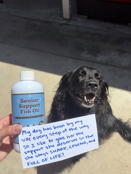
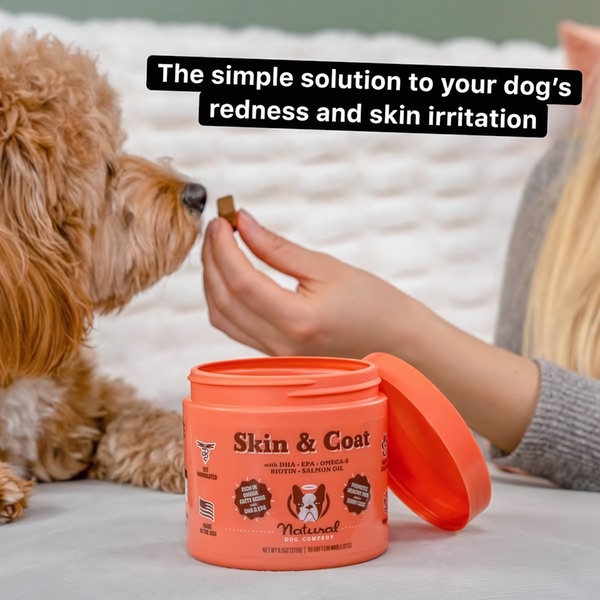
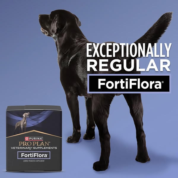
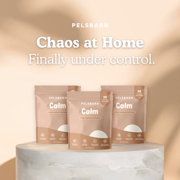

Promer helps you find the pattern, adapt it to your product, and create your own version in minutes.






