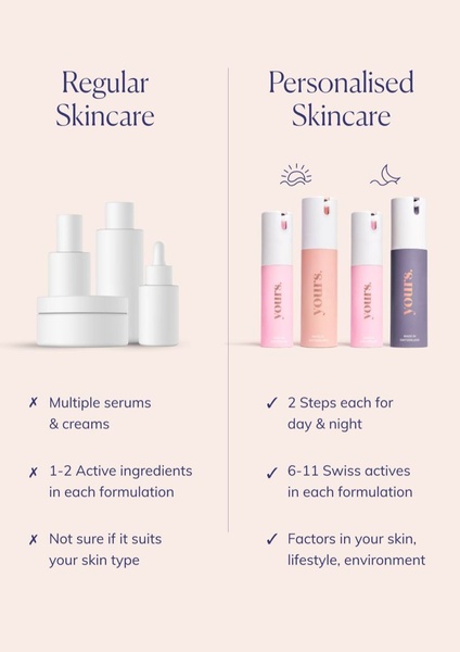
A clear, side-by-side comparison creative that uses a simple table to contrast generic skincare products with a personalized regimen, focusing on ingredients and convenience.
Free credits included. No card required
This personalized skincare ad creative uses a classic 'Us vs. Them' framework to visually simplify a complex buying decision for the customer. By contrasting the confusion of generic, multi-product routines against the clarity of a two-step personalized regimen, the brand positions their solution as the logical choice for busy consumers.
This structure performs well because it removes the 'analysis paralysis' typical in skincare shopping, allowing users to quickly scan the functional differences. Using Promer AI allows marketers to quickly replicate this comparison-based layout with their own product catalog, ensuring that the benefit-led messaging stays front and center regardless of the specific product niche.
Great ads start from a structure that simplifies the customer's choice rather than adding to their confusion.
Pro tip
When using a comparison table, keep your text points concise to match the scannable design style shown here. Ensure your 'checkmark' benefits specifically address common pain points in your category to make the contrast feel personal and urgent.




















Promer helps you find the pattern, adapt it to your product, and create your own version in minutes.






