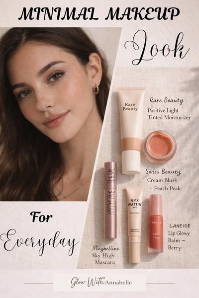
A clean, split-screen ad featuring a model's fresh look on one side and a curated flat-lay of makeup products on the other.
Free credits included. No card required
This minimal makeup ad creative functions by marrying human aspiration with clear product utility. By using a clean, split-screen layout, the brand immediately establishes a 'before and after' result without needing aggressive text, letting the natural glow of the model serve as the primary proof point for the everyday routine.
Visual clarity is the most effective way to lower the barrier for product discovery. For most beauty brands, customers want to see exactly what they are getting and how it fits into their life, which is why Promer AI often recommends this structured dual-column approach to highlight product sets instead of single items.
Great ads start from an idea, a feeling, or a structure, not a blank design.
Pro tip
When building a product grid ad, group your products by the specific result they provide rather than just by brand name. This shifts the focus from 'here is an item' to 'here is your solution', which typically increases engagement for multi-product ad sets.




















Promer helps you find the pattern, adapt it to your product, and create your own version in minutes.






