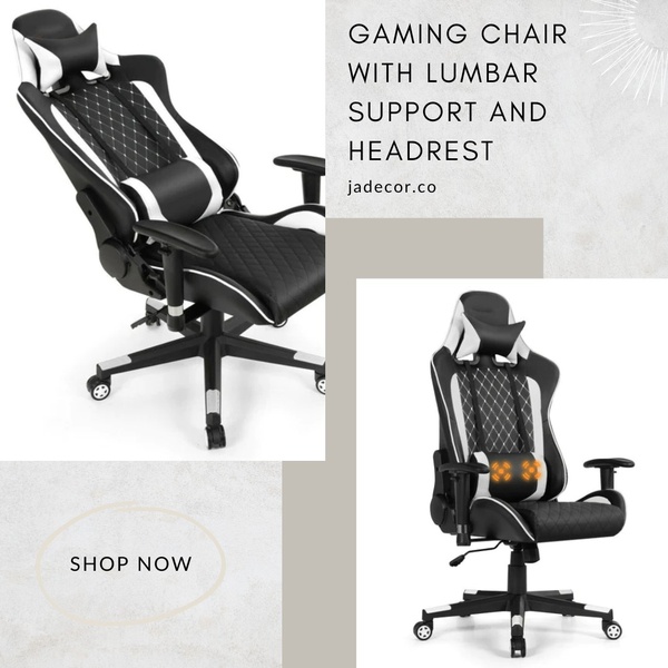
A clean, dual-panel display of a high-back ergonomic gaming chair highlighting lumbar support and headrest functionality.
Free credits included. No card required
This gaming chair ad creative excels by utilizing a minimalist split-screen layout that separates the product overview from the specific ergonomic feature set. The visual contrast between the clean white background and the black-and-white chair keeps the focus entirely on the product design while allowing the secondary panel to emphasize the functional lumbar support. By avoiding cluttered backgrounds, the design allows the potential buyer to immediately understand the chair's utility without needing to parse extra information.
This approach works because it mimics the user experience of browsing a catalog while maintaining the urgency of an ad, helping to reduce purchase friction. Using Promer AI to analyze such layouts can reveal how your own product photography can be repurposed to highlight specific comfort features like headrests or adjustable arms. This structured display strategy is particularly effective for e-commerce brands looking to establish credibility through clear, feature-forward communication.
A clean, minimalist layout that lets the product features speak for themselves is often more effective than complex visual storytelling.
Pro tip
When using a split layout for chairs, ensure the zoomed-in portion specifically targets the most requested comfort feature, such as the lumbar support or headrest. This creates a psychological link between the user's specific pain point and your product solution.




















Promer helps you find the pattern, adapt it to your product, and create your own version in minutes.






