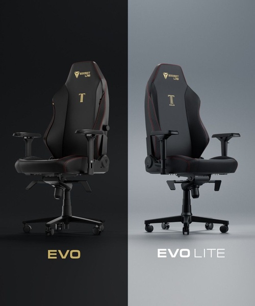
A split-screen visual comparison showcasing two gaming chair models to highlight distinct product positioning through color and branding.
Free credits included. No card required
This gaming chair ad creative utilizes a clear split-screen layout to instantly communicate the distinction between two product versions. By anchoring the visual hierarchy on symmetry and high-contrast color palettes, the brand manages to instantly educate the customer on product tiering without requiring complex text explainers.
This comparison strategy often works because it minimizes buyer confusion, allowing the viewer to visually process the value proposition of each item side-by-side. For teams looking to replicate this, Promer AI provides a structured way to maintain visual consistency across your product catalog, ensuring that every variation you test keeps your brand identity intact.
A clear comparison is often more effective at driving conversions than a busy sales pitch because it lets the product features speak for themselves.
Pro tip
When testing comparison ads, ensure the background lighting remains neutral to keep the focus entirely on the product silhouette. If your products have different price points, use the side-by-side frame to hint at the value gap rather than just stating specs.




















Promer helps you find the pattern, adapt it to your product, and create your own version in minutes.






