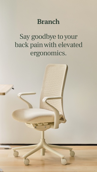
A high-conversion ad creative for an ergonomic office chair, utilizing a minimalist white space layout to emphasize comfort and relief from back pain.
Free credits included. No card required
This ergonomic office chair ad creative uses a clean, minimalist visual style to immediately isolate the pain point—back pain—without the clutter of traditional showroom photography. By pairing high-end product imagery with a clear, benefit-driven headline, the creative establishes trust and authority before the user scrolls past.
The core strategy here is to pair a direct pain-point hook with a neutral, high-contrast aesthetic that allows the product's primary value proposition to stand out. For ecommerce teams, this structure is highly effective at driving conversions because it removes distractions and keeps the viewer focused on the solution. You can replicate this structural precision using Promer AI to ensure your brand assets match this professional, high-converting caliber.
Great ads start from an idea, a feeling, or a structure, not a blank design.
Pro tip
When using a minimalist, high-negative-space layout like this, ensure your product photography is high-resolution with consistent lighting to avoid a 'cheap' look. Test slight variations in text placement—moving the headline higher or lower can significantly impact engagement on mobile screens depending on the platform.


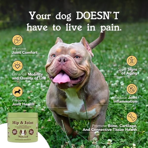
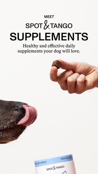

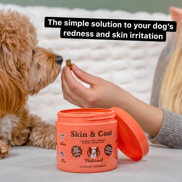
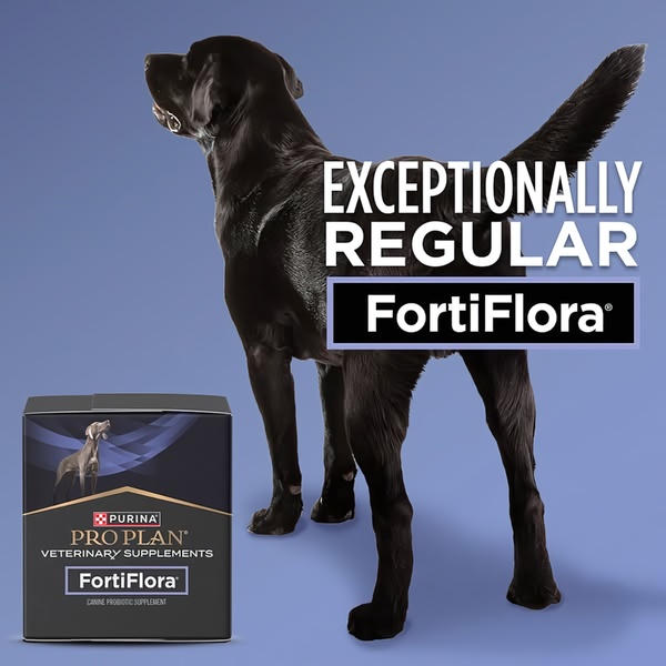
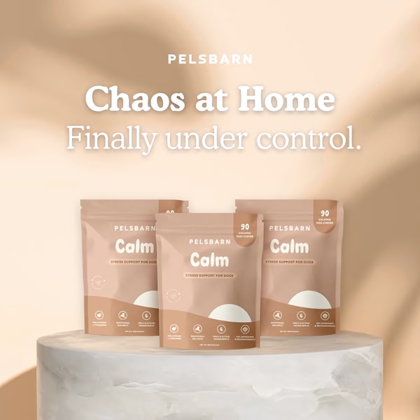


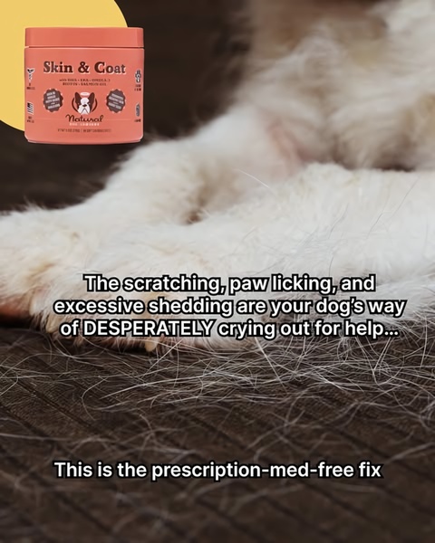

Promer helps you find the pattern, adapt it to your product, and create your own version in minutes.






