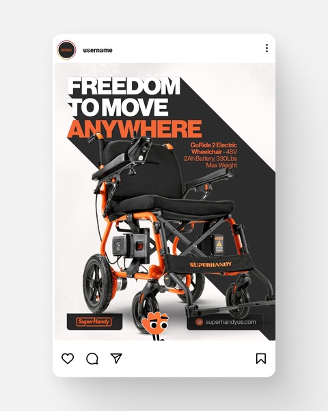
A 4:5 vertical ad showcasing an electric wheelchair with bold typography highlighting mobility and core product specifications.
Free credits included. No card required
This electric wheelchair ad creative succeeds by pairing a direct, aspirational hook with essential technical data, creating a balance between emotional benefit and logical validation. The ad leverages a high-contrast visual hierarchy that forces immediate focus on the value proposition of mobility before presenting the product specs. By positioning the text over a bold, angular graphical element, the viewer's eye is guided naturally from the message of freedom to the tangible product features.
For most ecommerce brands selling durable goods, this clear separation between brand sentiment and functional utility is essential to lowering cognitive load. Using Promer AI, teams can replicate this structured, high-conversion layout to effectively present their own products without needing to start from scratch. Maintaining this level of clarity in your ad design typically leads to improved engagement metrics as viewers quickly find the information required to move forward in their decision journey.
Great ads start from an idea, a feeling, or a structure, rather than just filling a blank canvas with random product photos.
Pro tip
When using high-contrast design themes like this one, ensure your brand's secondary color (the orange in this case) is used strictly for callouts or key specifications. This keeps the visual hierarchy clean and ensures the most important product details are never lost to cluttered design elements.




















Promer helps you find the pattern, adapt it to your product, and create your own version in minutes.






