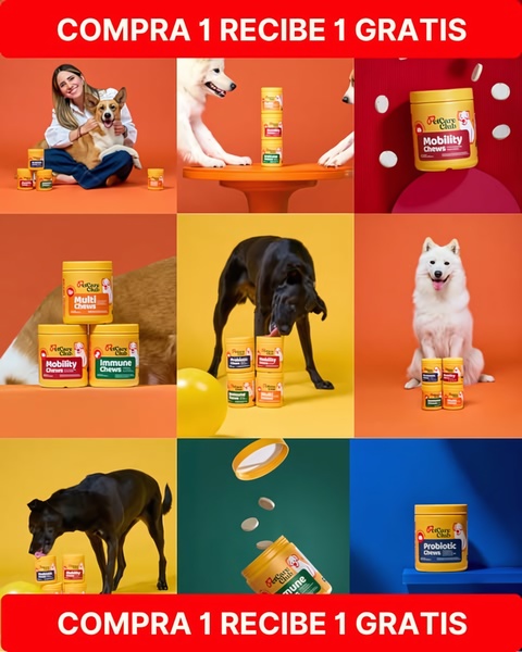
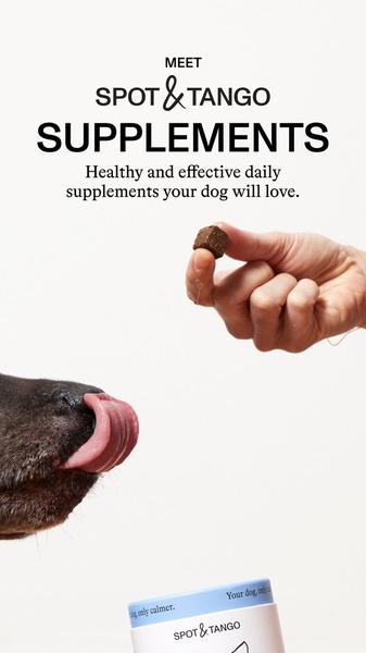
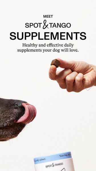
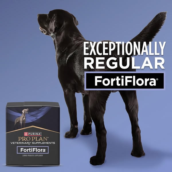
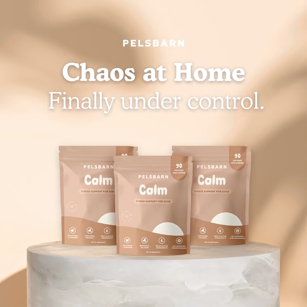
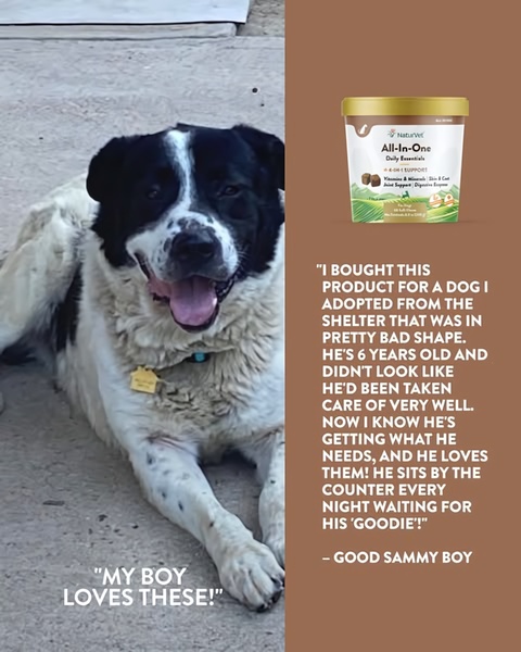
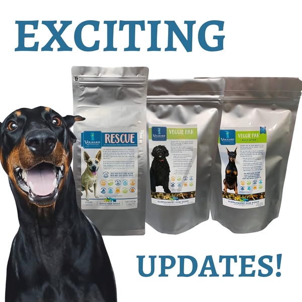
A high-energy, colorful grid-style ad for dog supplements using a recurring BOGO offer to drive conversion.
Free credits included. No card required
This dog supplement ad creative uses a high-contrast grid layout to capture attention instantly, combining a bold BOGO offer with varied visual content. The effectiveness of this creative relies on the repetition of product utility combined with the clarity of a direct financial incentive. By showcasing multiple use cases across the grid, the brand manages to build product familiarity while the repeating header ensures the offer is never missed during a fast scroll.
For most ecommerce teams looking to optimize their visual hierarchy, implementing a structured layout like this helps anchor consumer attention. You can use Promer AI to analyze the distribution of your own product assets and map them to a similar multi-cell format, ensuring that your core value proposition remains legible across mobile feeds.
Great ads start from an idea and a consistent structure that treats the offer as the hero, rather than relying on design complexity.
Pro tip
When using a grid layout, ensure every individual cell holds a specific, distinct value or product benefit to avoid visual clutter. In most cases, having a single high-contrast hero color across all cells—while keeping the background colors distinct—helps the eye navigate the ad without feeling overwhelmed.











Promer helps you find the pattern, adapt it to your product, and create your own version in minutes.






