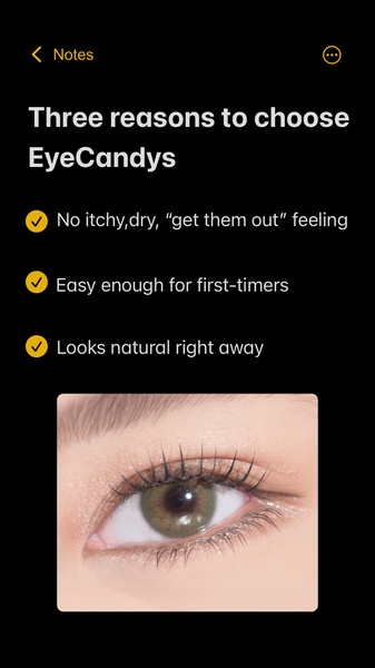
A minimalist, benefit-oriented graphic advertisement for colored contact lenses using a clear three-point list format.
Free credits included. No card required
This contact lenses ad creative utilizes a high-contrast, minimalist design to cut through mobile feed clutter. By pairing a simple, three-point list of customer pain points with a high-quality product close-up, the brand keeps the user focused entirely on product utility and comfort rather than abstract lifestyle imagery. This direct, benefit-first structure eliminates friction and reduces the cognitive load required for a potential buyer to evaluate the product.
Adopting this clear, benefit-oriented communication pattern is often effective for beauty products where comfort and ease-of-use are the primary purchase drivers. You can replicate this structural clarity using Promer AI to swap your product visuals while retaining a high-converting, text-first layout that addresses specific user objections directly in the ad image.
Great ads start from an idea, a feeling, or a structure, not a blank design.
Pro tip
Instead of listing generic benefits, use the ad copy to specifically negate the most common customer fear or doubt for your product category. A list-based hook works best when the final bullet point mirrors the ultimate aesthetic or performance desire of your user.

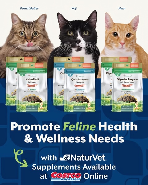

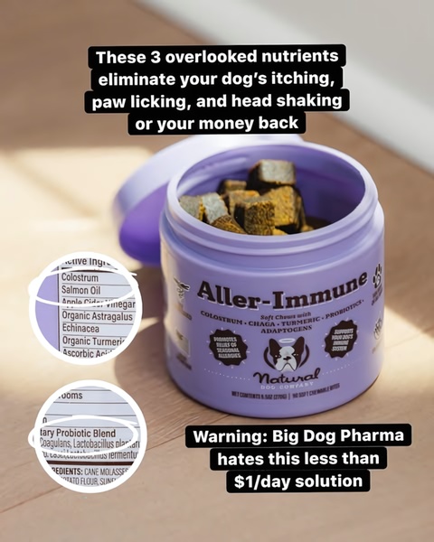

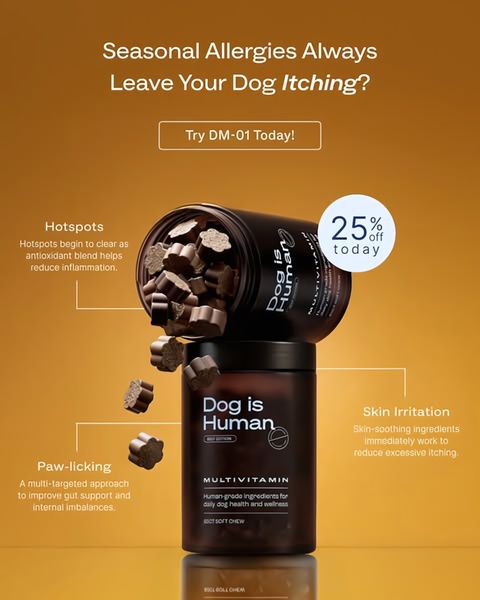












Promer helps you find the pattern, adapt it to your product, and create your own version in minutes.






