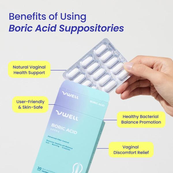
A high-clarity product visual using directional callouts to explain the primary benefits of Boric Acid Suppositories to the consumer.
Free credits included. No card required
This Boric Acid Suppositories ad creative leverages a clean, high-key visual style to strip away any complexity, putting the focus entirely on the core benefits. By using clear, high-contrast yellow callouts, the brand directs the user's eye exactly where they want it to land, making the value proposition instantly digestible during a fast scroll. Clarity through visual signposting allows potential customers to decode product benefits in milliseconds, reducing the mental load required to make a purchase decision. Using a platform like Promer AI, teams can replicate this structured educational approach for their own products by swapping static imagery with benefit-focused overlays. This approach works well in categories where trust and clarity are the primary hurdles to conversion, as it positions the brand as helpful and transparent.
Great ads are built on a foundation of structural clarity, using visual hierarchy to guide the user toward an informed decision rather than overwhelming them with noise.
Pro tip
When using this visual callout style for health products, ensure your labels directly address the specific pain points mentioned in your reviews. Test one variation with emotional, problem-aware language and another with purely clinical, feature-focused language to see which resonates better with your target audience.




















Promer helps you find the pattern, adapt it to your product, and create your own version in minutes.






