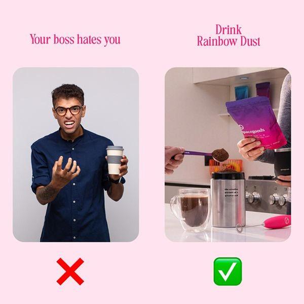
A split-screen comparison ad that contrasts a stressful, unhappy user experience with a positive, refreshing alternative using the product.
Free credits included. No card required
This Rainbow Dust ad creative effectively uses a simple split-screen layout to frame the product as an immediate solution to daily stress. The contrast between a negative emotional state and the positive, refreshing product experience creates a clear, instant hook that stops the scroll. By positioning the product as the antidote to professional frustration, the ad communicates value without relying on complex technical claims or long-form descriptions.
In most cases, this 'us vs. them' or 'before vs. after' pattern provides a clear psychological anchor for potential customers. Using Promer AI allows you to reverse-engineer this binary structure for your own product range, ensuring your visual hierarchy mirrors the clarity of this effective comparison layout.
Great ads start from an idea, a feeling, or a structure, not a blank design.
Pro tip
When using a negative-to-positive hook, ensure the 'solution' side is visually vibrant or satisfying to look at. For food or beverage products, a high-quality action shot of the drink preparation—like the one used here—provides the strongest sensory payoff for the viewer.


Promer helps you find the pattern, adapt it to your product, and create your own version in minutes.






