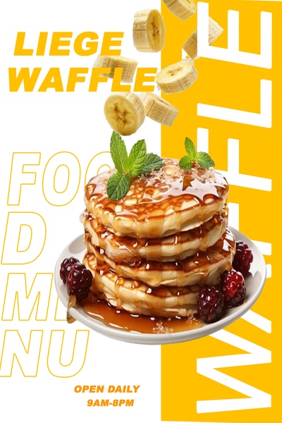
A vertical ad featuring a stack of waffles topped with syrup and fresh fruit, utilizing high-contrast yellow backgrounds and bold, clean typography.
Free credits included. No card required
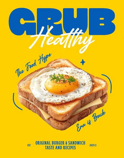
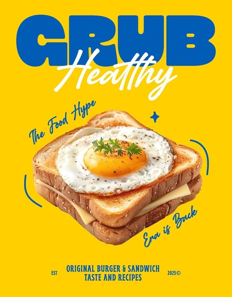
This liege waffle ad creative utilizes a high-contrast color palette paired with minimalist typography to prioritize visual appetite appeal as the primary hook. By framing the product against a bold yellow block and utilizing negative space, the composition ensures that the textures of the syrup, berries, and waffles remain the focal point for the viewer, effectively stopping the scroll through sensory stimulation. This approach demonstrates that simplifying your visual hierarchy often leads to clearer communication of your product value proposition in food-based advertising. In most cases, relying on high-quality studio photography allows brands to bridge the gap between digital representation and real-world cravings, a strategy easily replicated using Promer AI to maintain consistent branding across diverse product categories.
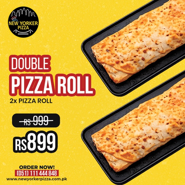
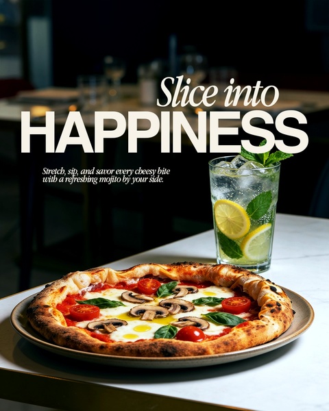
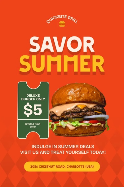
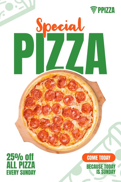
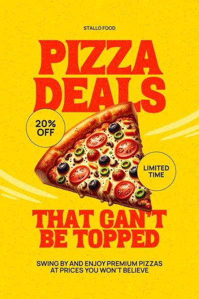
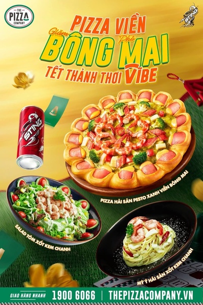
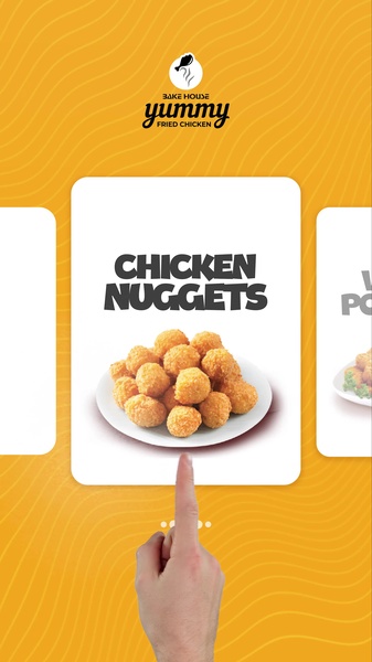
Great food ads rely on high-fidelity visual cues that communicate flavor and freshness before the user even reads the headline.
Pro tip
When using high-contrast backgrounds like this, ensure your primary font weight matches the visual weight of the product. Using a bold, sans-serif typeface allows your headline to hold its own against bright, dominant colors without losing readability.
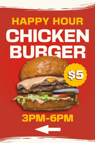
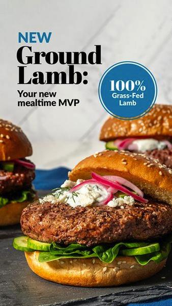
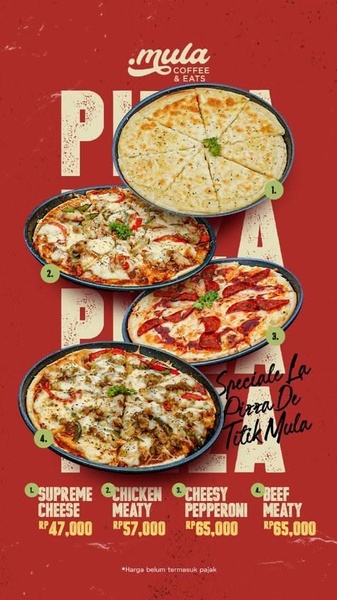
Promer helps you find the pattern, adapt it to your product, and create your own version in minutes.






