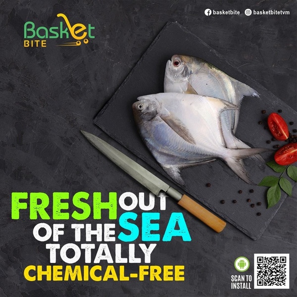
A clean, minimalist 1:1 square graphic featuring raw fish on a slate board with a chef's knife, emphasizing freshness and safety through bold typography.
Free credits included. No card required
This Fresh Fish ad creative leverages a minimalist, top-down photography style to convey an immediate sense of purity and premium quality. By pairing raw, fresh product imagery with a direct value proposition, it creates an unmistakable signal of quality that bypasses the viewer's defensive scroll. The high-contrast color palette, featuring neon green and cyan against a deep grey slate, ensures the most critical information—the product's safety—pops against the professional background.
This pattern works effectively for perishable goods because it treats the product as the hero, allowing for a focused, high-trust presentation. Using Promer AI, you can replicate this clean, authoritative layout for your own product range to establish market presence quickly. While every category responds differently to color choices, the principle of combining high-quality, authentic product shots with clean typography remains a consistent driver for conversion in food categories.
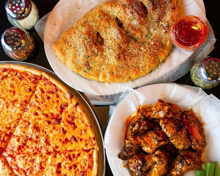
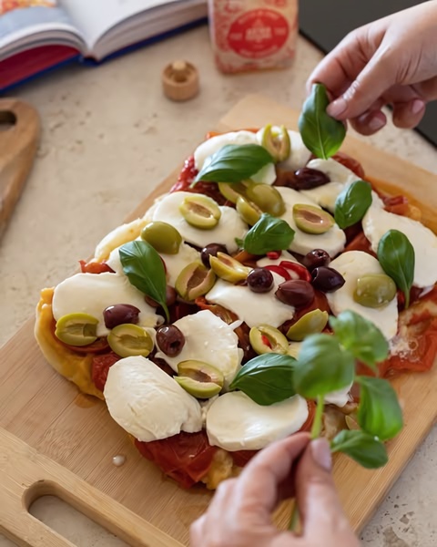
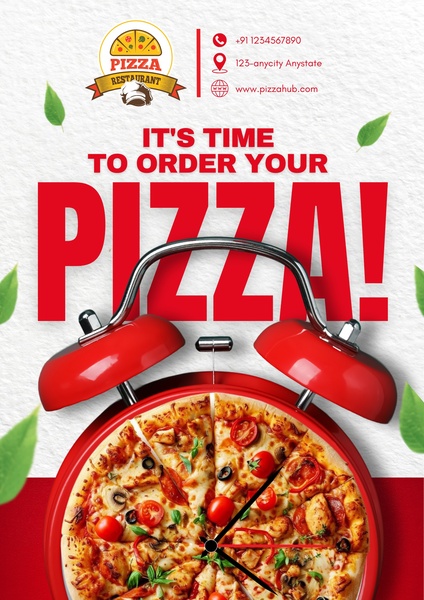
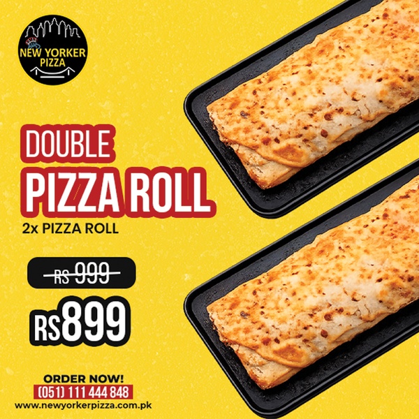
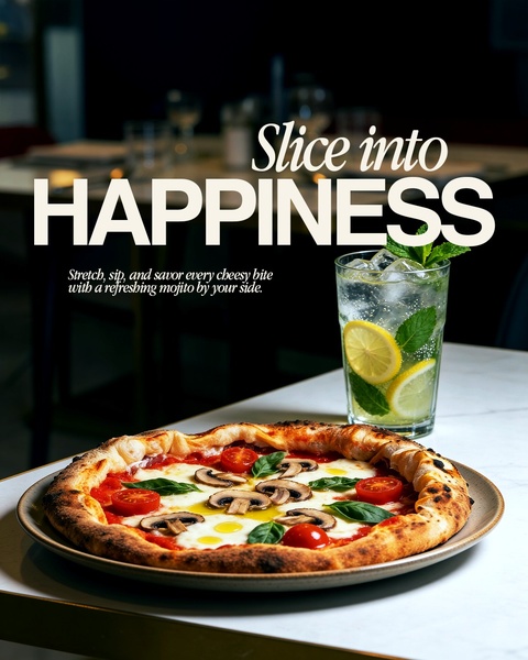
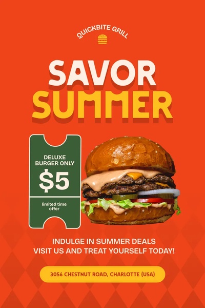
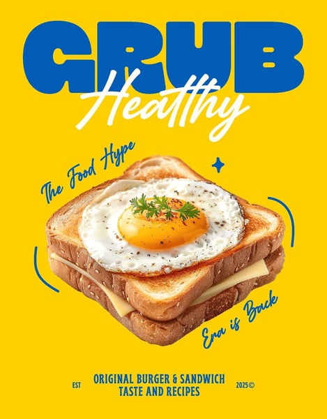
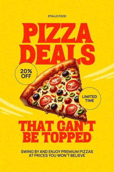
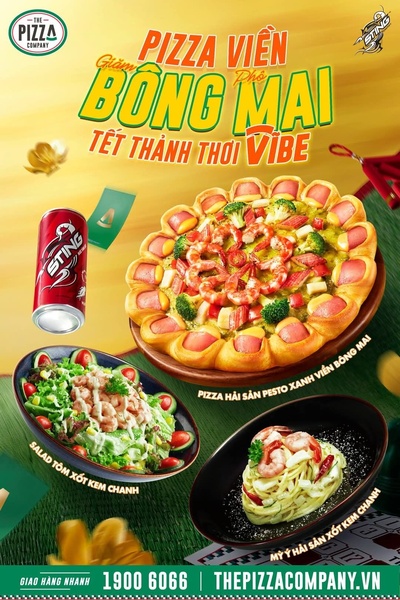
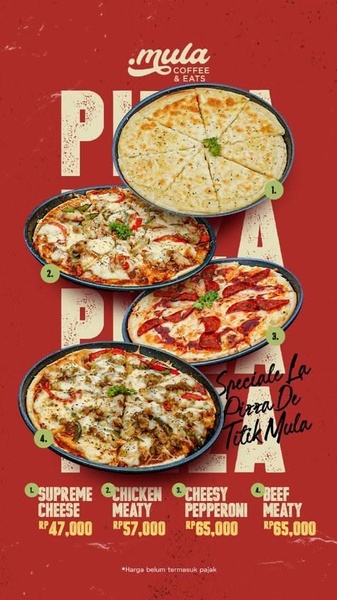
Great food ads rely on high-fidelity visual evidence combined with a single, unshakeable value proposition that cuts through the noise.
Pro tip
When focusing on a 'chemical-free' or safety-based angle, ensure your visual elements support the claim through lighting. High-key lighting or clean slate textures, as seen here, naturally trigger a 'clean' association in the consumer's mind compared to chaotic or overly processed imagery.

Promer helps you find the pattern, adapt it to your product, and create your own version in minutes.






