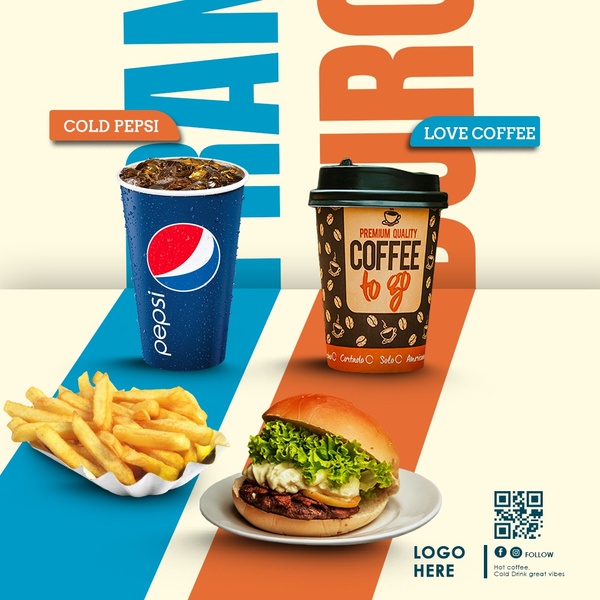
A square ad creative displaying a direct pairing of a burger and fries with two beverages, utilizing clean color-blocking to separate the menu items.
Free credits included. No card required
This fast food combo ad creative succeeds by using a clean split-screen design that guides the eye between two distinct product sets. The use of high-contrast diagonal color blocking acts as a visual anchor, creating an immediate association between the cooling blue of the beverage and the warm orange of the meal, which simplifies the viewer's decision-making process at a glance.
This structural efficiency is a proven strategy for menu-heavy brands that need to showcase multiple items without creating clutter. By leveraging Promer AI, teams can replicate this balanced composition for their own product catalogs, ensuring that each SKU gets dedicated visual space while maintaining brand consistency across all placements.
Great ads start from a clear structural idea that allows the products to speak for themselves through simple, deliberate contrast.
Pro tip
When using split-screen designs, ensure your background colors are directly pulled from your brand's primary and secondary palette to maintain high recognizability. Test the placement of the product against the diagonal line to see if shifting the object slightly enhances the feeling of depth or motion.
Promer helps you find the pattern, adapt it to your product, and create your own version in minutes.






