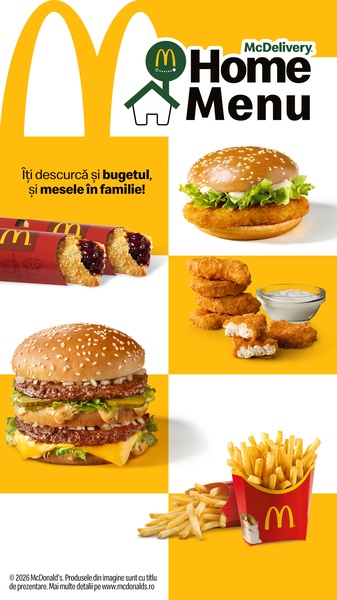
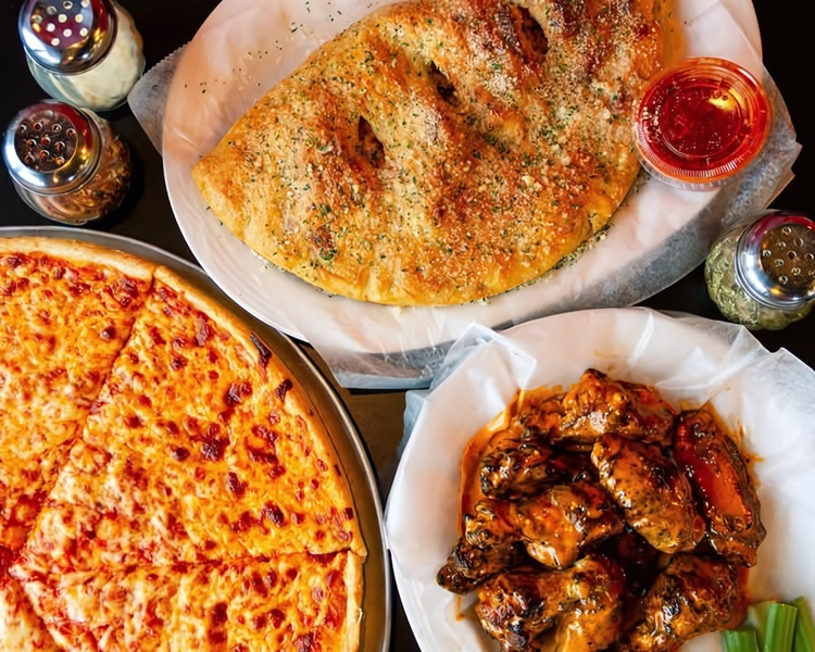
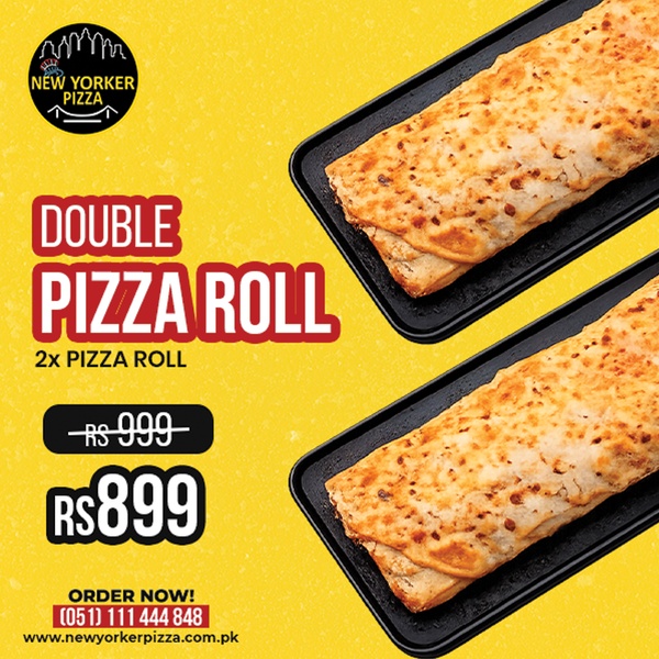
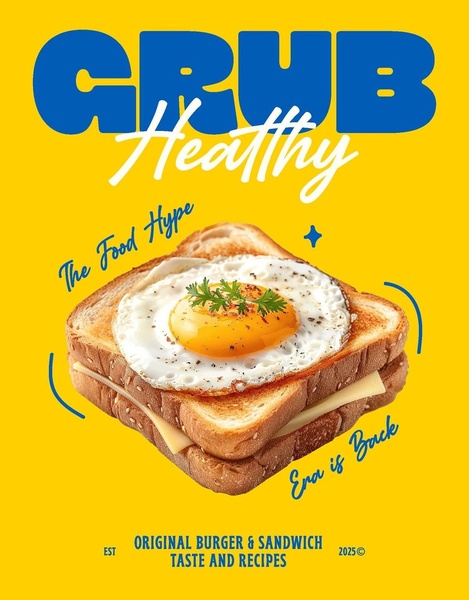
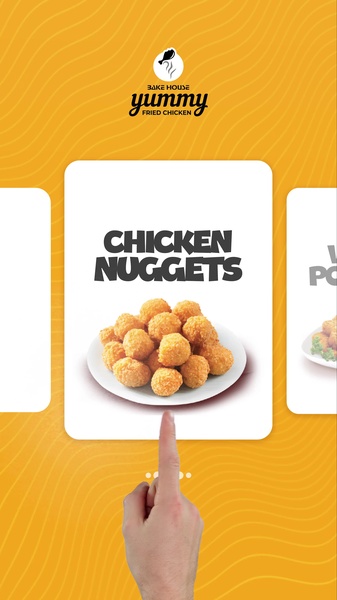
A vertical 9:16 ad creative using a clean grid layout to showcase multiple menu items against a bold yellow background.
Free credits included. No card required
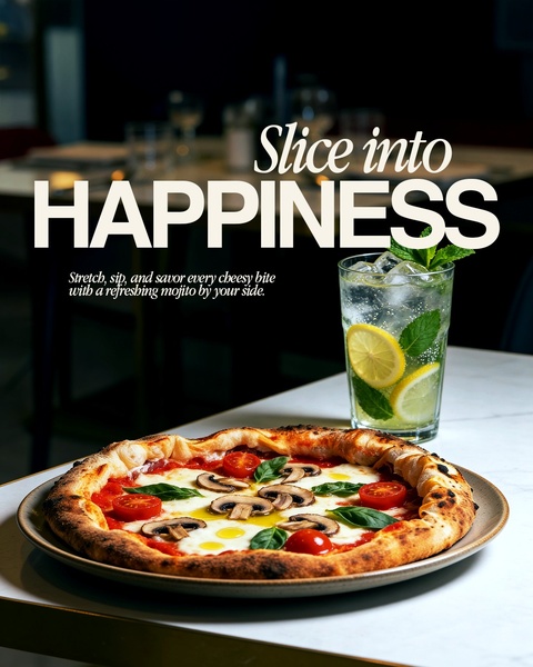
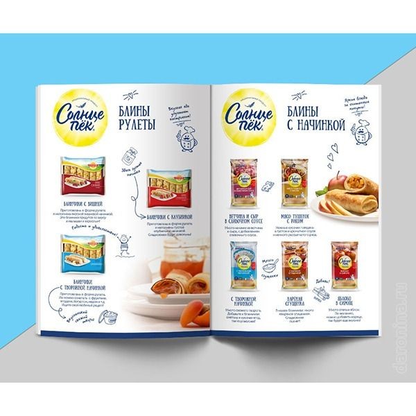
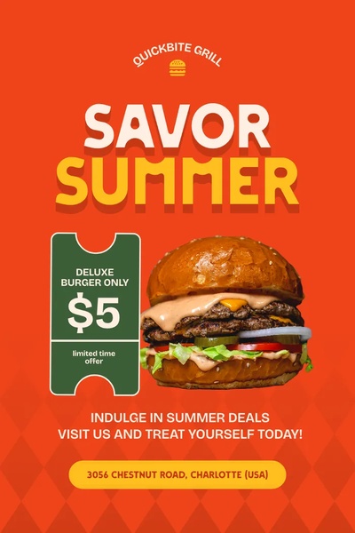
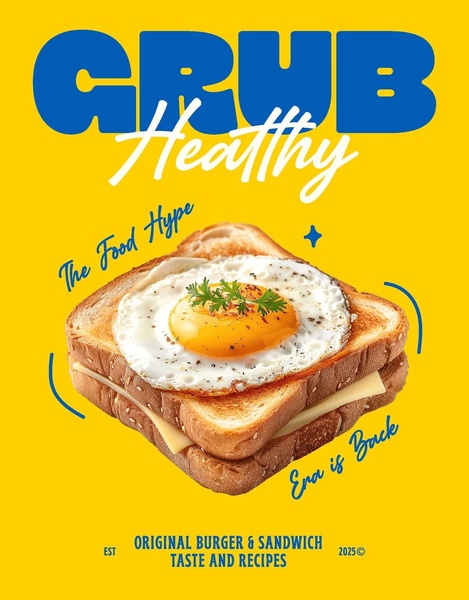
This fast food ad creative utilizes a highly organized grid layout to display multiple menu offerings simultaneously without overwhelming the viewer. The structure relies on the 'Direct Value Proposition' hook, which immediately addresses the consumer's need for budget-friendly family dining while visually reinforcing that message with high-quality product imagery.
For most ecommerce teams, this pattern works because it treats the ad space as a mini-menu, making it an ideal approach for businesses with diverse product catalogs. You can easily replicate this visual efficiency using Promer AI by analyzing the layout’s composition and applying a similar grid structure to your specific product photography.
Great ads start from a structured idea that organizes your product messaging as effectively as it organizes your visuals.
Pro tip
When using a grid layout, ensure that your most 'craveable' or best-selling product occupies the largest or top-most quadrant of the image. This creates a visual hierarchy that guides the viewer's eye from your hero product to the supplementary items, typically increasing overall click-through rates.

Promer helps you find the pattern, adapt it to your product, and create your own version in minutes.






