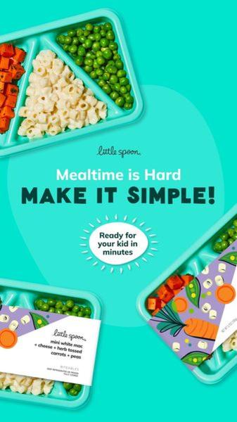
A clean, high-contrast flat lay showcasing children's meal trays with bold, direct typography that calls out the parent's primary struggle.
Free credits included. No card required
This children's meal delivery ad creative succeeds by pairing a high-contrast flat lay visual with a direct, relatable pain point. By explicitly stating that mealtime is hard, the ad immediately aligns with the viewer's daily frustrations before offering the product as the obvious, simplified solution.
This structure works for most ecommerce teams because it minimizes cognitive load, allowing the viewer to process the value proposition in seconds. Using Promer AI, you can replicate this visual hierarchy and direct messaging style to ensure your own product ads cut through the noise effectively without relying on overly complex designs.
Great ads start from a clear understanding of your customer's daily struggle, not from a desire to show off your product design skills.
Pro tip
When using direct pain-point hooks, test one variation that focuses on the emotional relief of the solution alongside the functional benefits. Ensuring your typography hierarchy prioritizes the 'problem' first often yields higher engagement rates for high-frequency purchase products.
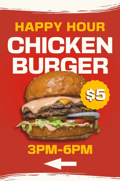
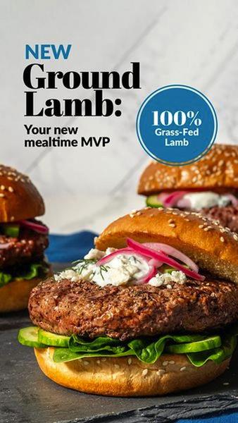
Promer helps you find the pattern, adapt it to your product, and create your own version in minutes.






